Notes

The visual language
behind Tariela's deck

Seventy-eight original cards, built to read clearly at the size of a browser popup and to feel like they belong to the rest of the product, not to a separate mystical aesthetic.

Why not a licensed deck

The easiest option would have been licensing an existing public-domain Tarot deck and moving on. Tariela commissioned original art instead, for a specific reason: a deck built for a browser popup has different constraints than a deck built for a physical card in the hand. Faces need to read clearly at a fraction of their printed size, hold up next to warm ivory and gold interface instead of a black velvet cloth, and feel like part of the same object as the planetary-hour dial beside them.

Keeping the traditional structure

The cards follow the established Rider-Waite-Smith structure — the same seventy-eight cards, the same major and minor arcana, the same traditional positions and core meanings anyone who has read about Tarot before would recognize. That was a deliberate choice against inventing a new symbol system from scratch: recognizability matters more here than novelty, because the interpretation itself is doing the new work, not the vocabulary of the cards.

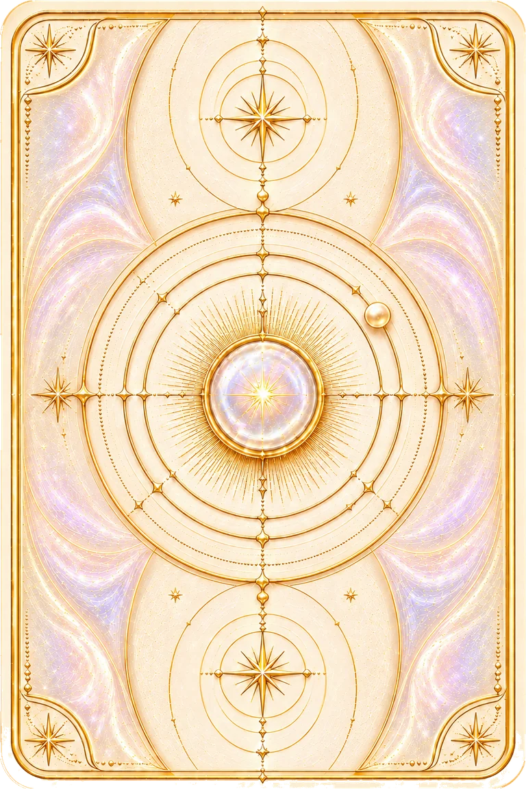
Tarot card back

The deck's job is to support a small ritual, not to be a gallery piece someone has to admire before they can use it.

Built to be looked at twice

Each card had to survive two very different jobs: sitting quietly face-down as part of a spread, then rewarding a closer look once revealed. The palette pulls from the same warm ivory, gold, and opal-glass tokens used everywhere else in Tariela, so a revealed card feels like it arrived from inside the product rather than a stock-art library pasted on top of it.

See the cards
in the real popup

Add to Chrome
Installation guide